Improved accessibility for Svenska Lotterier & Insamlingar
UX-led redesign, accessibility review, and interface refinement of a service app connected to Sweden’s non-profit and fundraising sector
UX
Product Design
Accessibility
App

Vinstkollen is a digital service connected to fundraising initiatives and non-profit organizations across Sweden. I took over an existing design and identified significant gaps in flows, edge cases, and accessibility. My role was not to redesign from scratch, but to complete and stabilize the experience so it could work in real life.
The focus was to strengthen the UX foundation, ensure technical feasibility, and improve accessibility for an older user base.
Improvements naturally extended into interface structure, hierarchy, and readability to ensure the design worked in practice.

Client | Svenska Lotterier & Insamlingar |
Industry | Non-profit & Fundraising Services |
Timeline | 2024 |
My Role | Lead UX Designer |
Team | 1 UX Lead, 1 Visual Designer, Project Lead, Developers, and client-side stakeholders. |
Context
Svenska Lotterier & Insamlingar provides digital services connected to subscription-based fundraising initiatives supporting non-profit organizations across Sweden. Users receive physical lottery tickets by mail and use the Vinstkollen app to register tickets, view winnings, and handle payouts through Swish.
The service plays an important role in reducing administrative work while creating a more accessible and user-friendly digital experience for a broad audience.
Key focus areas
The project required both UX restructuring and refinement of existing interface patterns to ensure accessibility, clarity, and system consistency across all user flows.
Accessibility improvements for an older user base
UX completion of missing and undefined flows
Edge case handling and system states
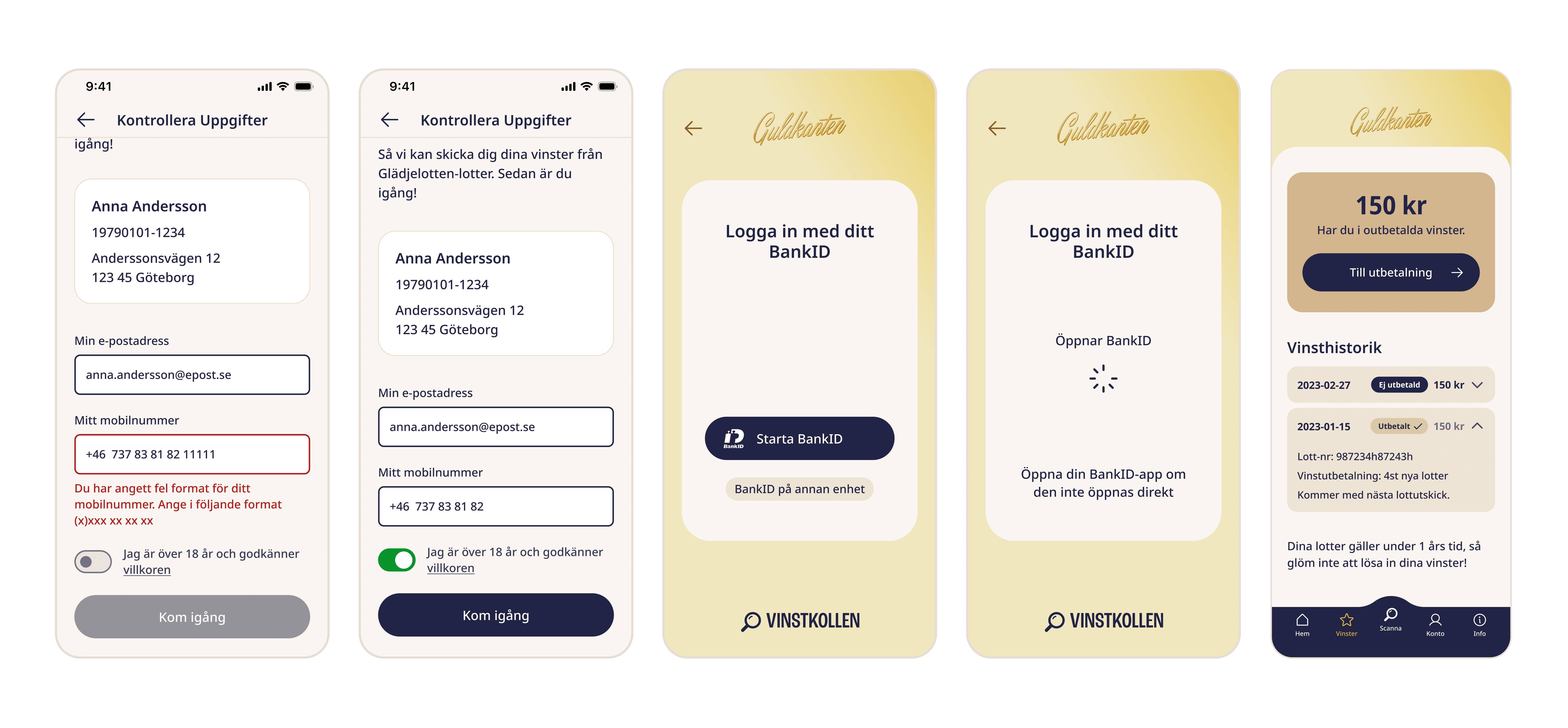
Identity and authentication flows (BankID, Swish)
Multi-tenant behavior and configuration logic
Error handling and user guidance
The challenge
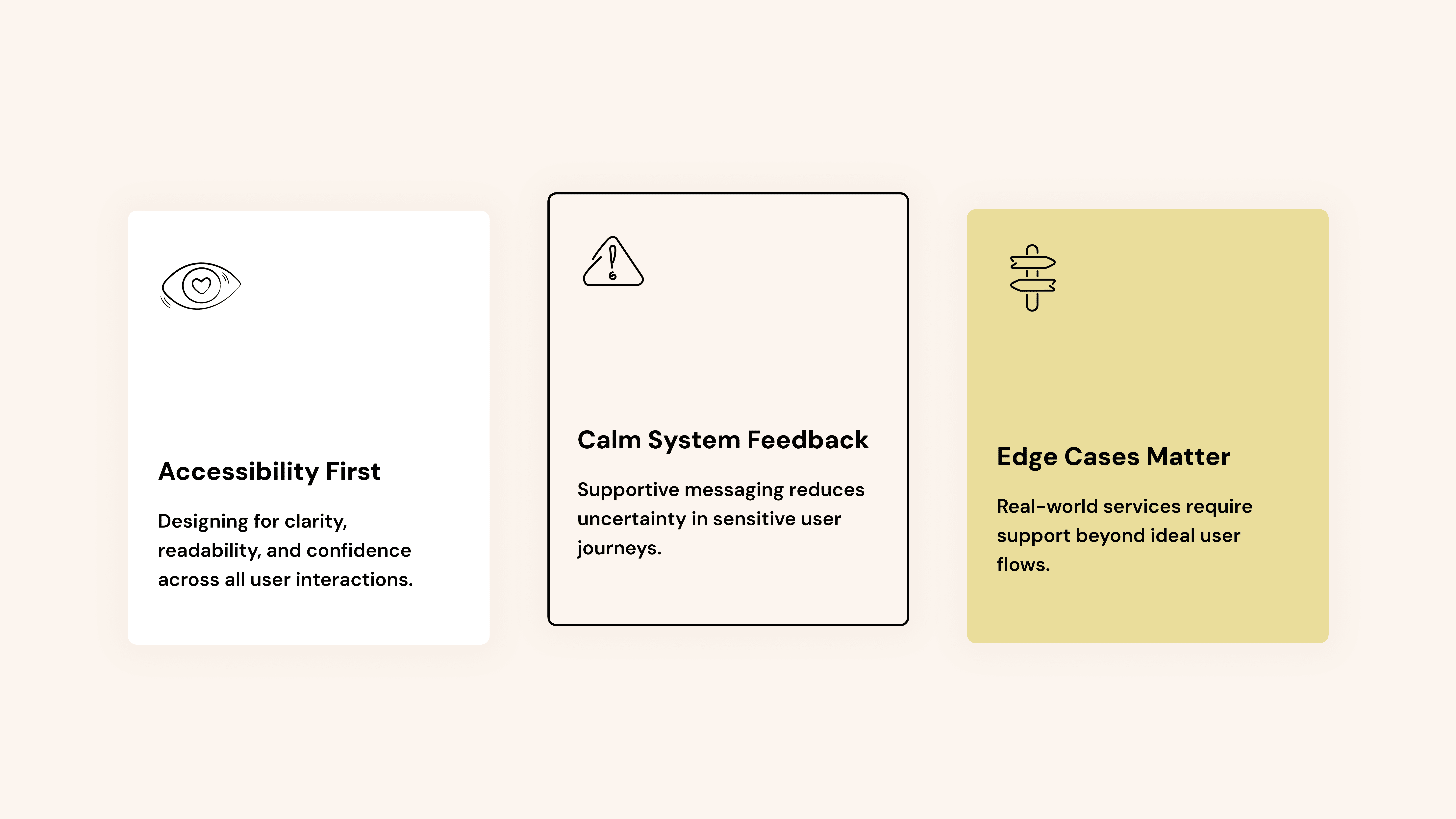
The existing design covered the main user journeys but lacked support for many real-world scenarios. Important accessibility considerations, edge cases, and technical constraints were either missing or undefined, making the experience fragile outside of ideal flows.
The challenge was not to redesign the product entirely, but to strengthen and complete the existing experience in a way that felt reliable, accessible, and production-ready. This also meant working within an existing visual direction while still improving hierarchy, readability, and interaction design where needed.
My approach
I began with a UX review of the existing wireframes, identifying gaps in accessibility, system feedback, edge cases, and incomplete flows connected to identity and payouts.
The initial focus was to strengthen the product structurally while working within the existing visual direction, creating a more resilient and production-ready UX foundation.
As the project evolved, my improvements extended beyond UX structure into interface refinement, including hierarchy, spacing, typography, and readability adjustments. These changes ensured the design was both usable and visually coherent before being further refined together with a digital visual designer.
Improving accessibility
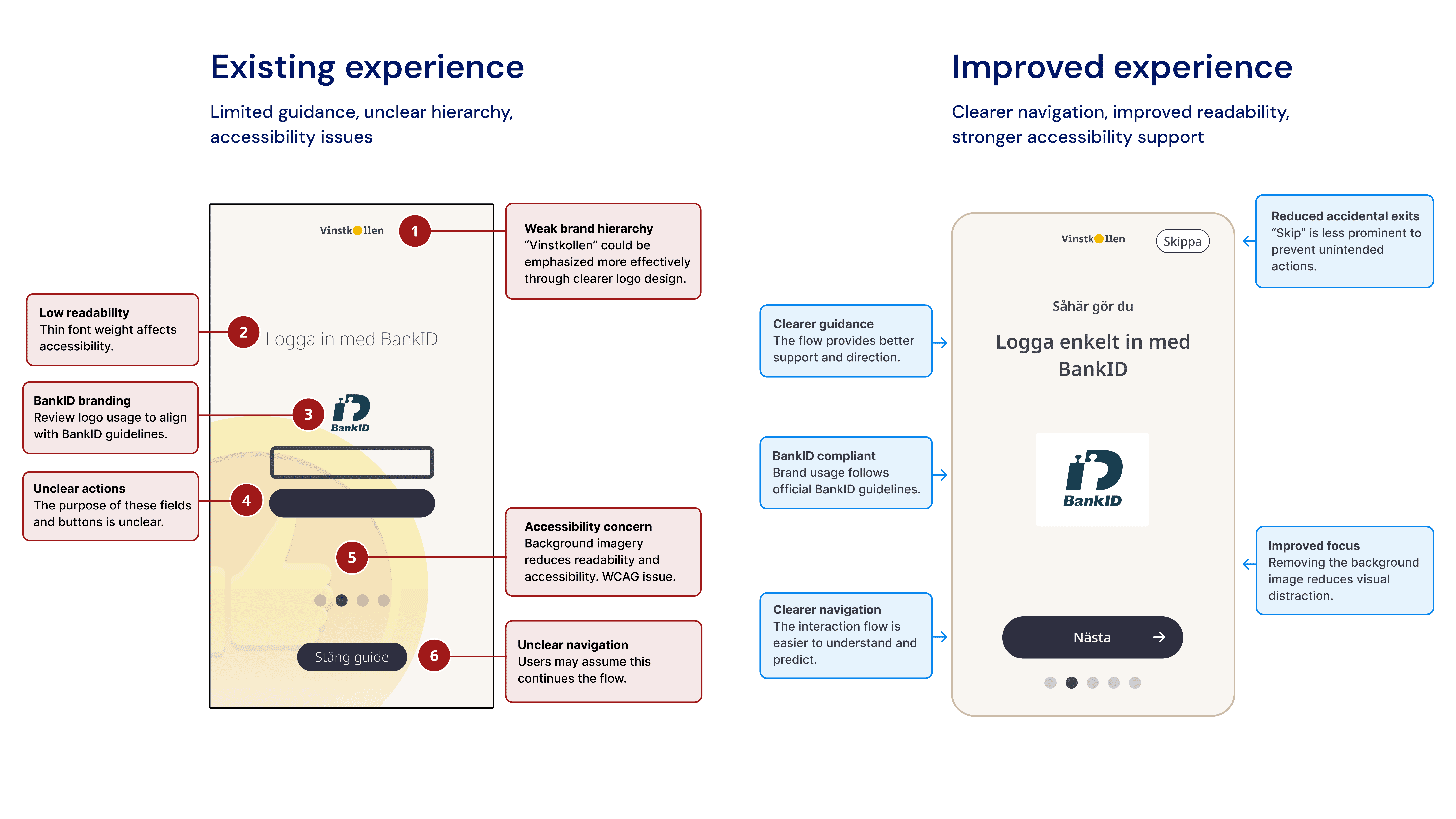
Accessibility was one of the primary goals of the project. The existing design contained several readability and usability challenges, particularly for an older audience.
Completing missing flows
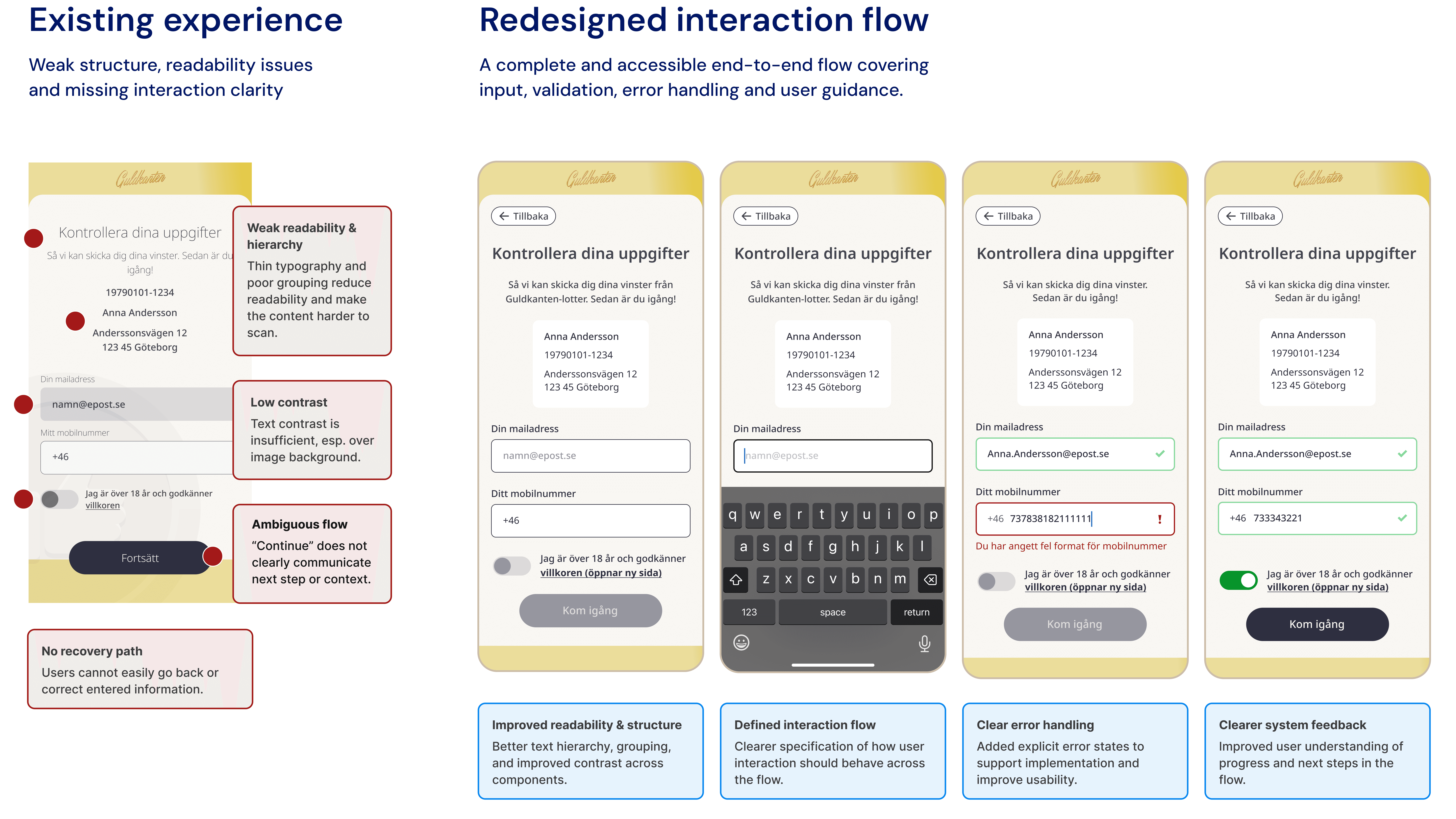
Several important user journeys lacked clear interaction states, validation, and error handling. The goal was to create a more complete and predictable experience for both users and developers.
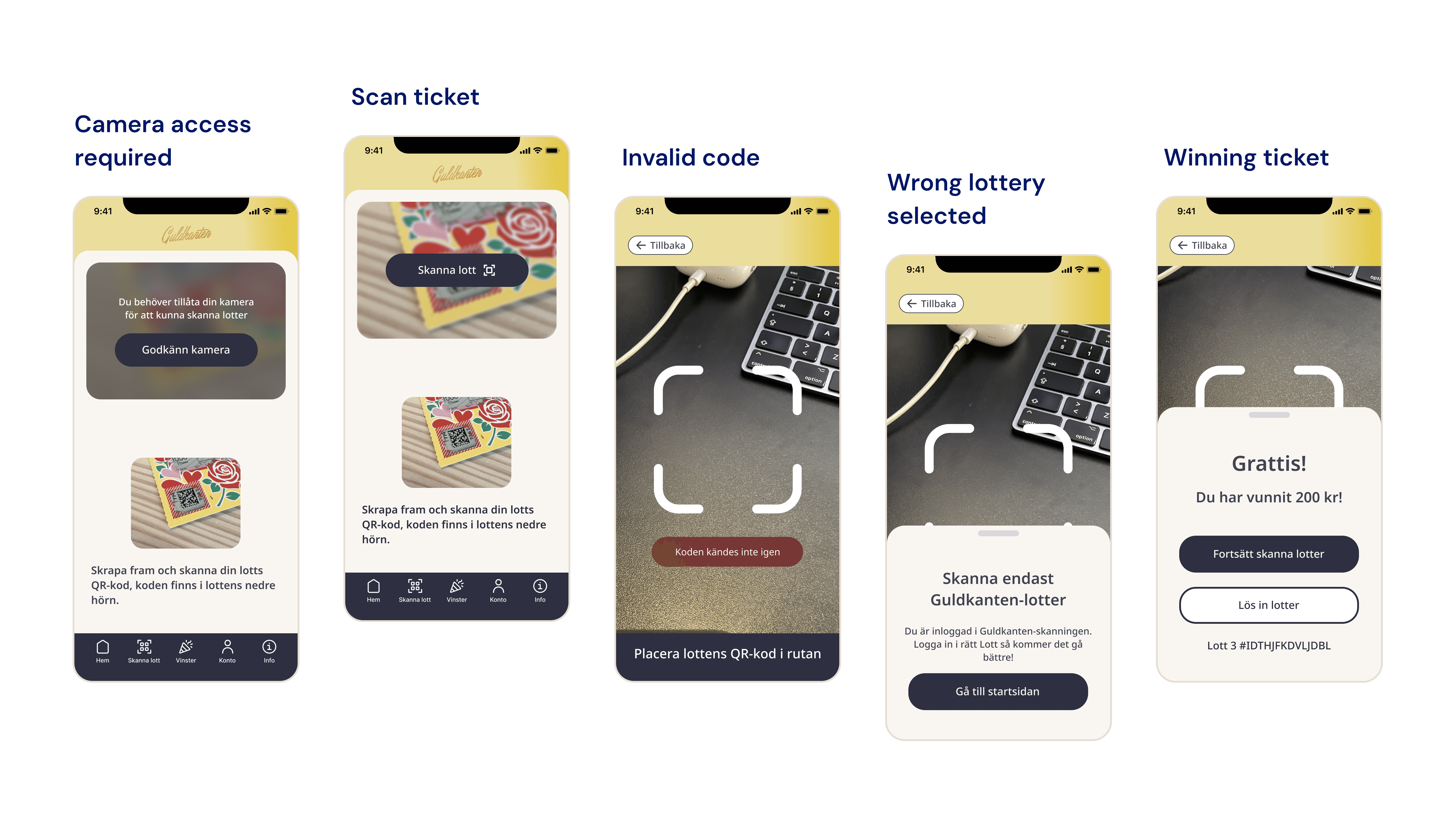
Designing beyond the happy path
Many critical scenarios were either missing or undefined in the original concept. Working closely with technical stakeholders, I identified edge cases, clarified expected system behavior, and designed the states, messaging, and guidance needed to support real-world usage. This included both user-driven errors and system-driven constraints that needed to be reflected in the interface design.
Outcome
The result is a more complete and accessible product experience with:
stronger edge-case handling
clearer user guidance
improved accessibility
better alignment between UX and technical implementation
a more reliable foundation for future development
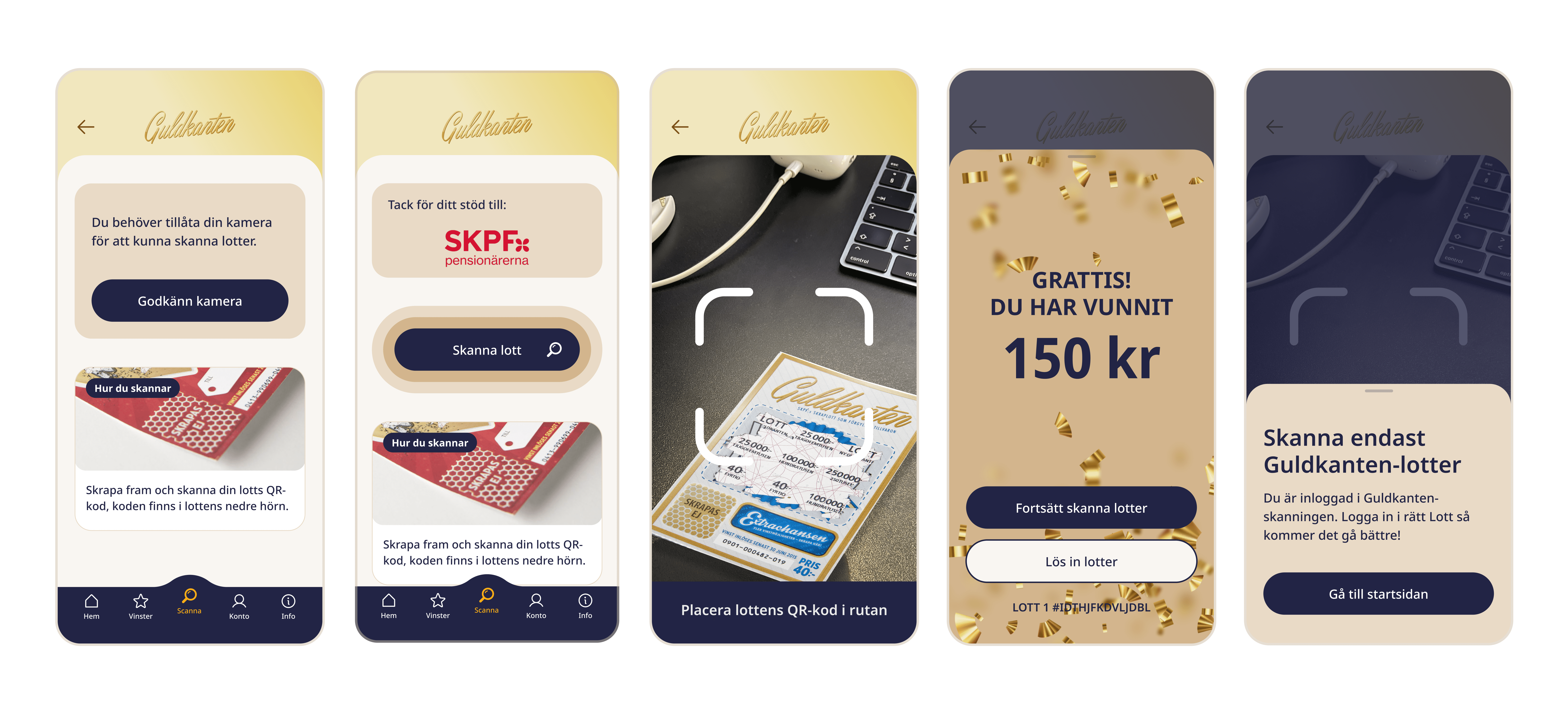
Final refined interface
The final interface was further refined in collaboration with a digital visual designer, building on the UX structure and interface refinements made during the design phase.
Accessibility, hierarchy, and flow consistency were prioritized throughout the UX phase and carried through into the final visual refinement.
Download the app:
App Store: Vinstkollen ↗
Google Play: Vinstkollen ↗
